


Education Authority of Northern Ireland
Transforming how Northern Ireland’s schools connect with a user-first Digital Learning Environment
TL;DR
Working on Capita’s £485m EdIS bid, I designed a user-centred vision for a new Digital Learning Environment (DLE) connecting schools across Northern Ireland. In just two weeks, I created proto-personas, mapped student and teacher journeys, and delivered high-fidelity concepts that balanced accessibility, personalisation, and bilingual needs. The result was a compelling, human-focused vision that demonstrated how UX could transform education delivery. The bid team credited the UX outputs as a differentiator that helped Capita progress to the next procurement stage.
Problem statement
The Education Authority of Northern Ireland (EA) launched the £485m EdIS programme to modernise its education system. As part of Capita’s bid, the UX team was tasked with imagining a Digital Learning Environment (DLE) portal: a single, accessible gateway for pupils, teachers, and staff. The goal wasn’t to produce a finished product, but to show a compelling vision of how a user-centred approach could reshape education across the region.
My UX Responsibilities
My role focused on translating bid requirements into user-centred design concepts and ensuring that both student and teacher needs were represented. I defined task flows and mapped key journeys, then produced high-fidelity screens that demonstrated accessibility, personalisation, and engagement. Beyond creating visuals, I was responsible for showing how a user-centred approach could strengthen Capita’s bid, positioning UX not just as design work but as a strategic differentiator.
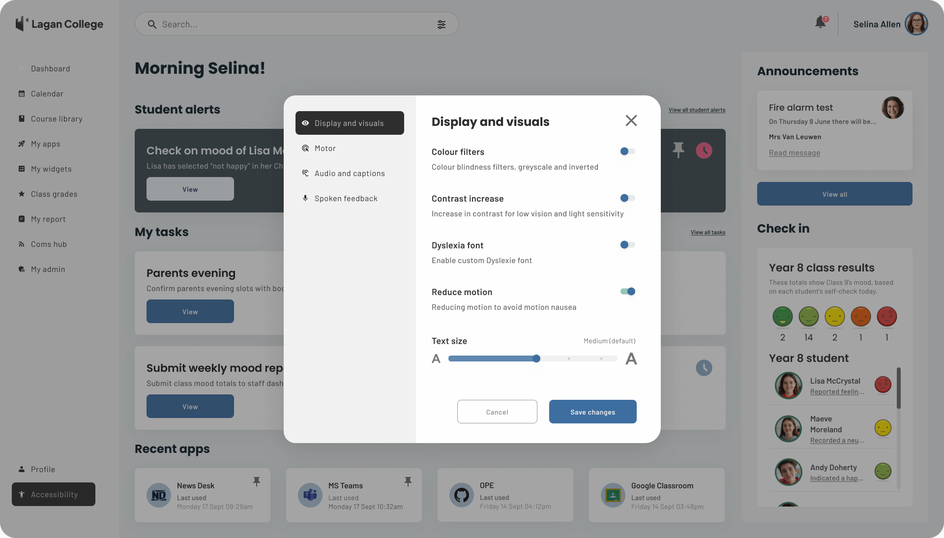
High-fidelity concept - Accessibility settings modal, showing the final look and feel of display and visual options within the DLE.
Approach
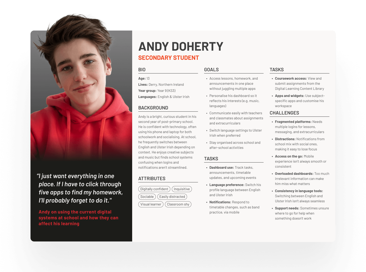
The project began by defining proto-personas for students and teachers, drawing on EA documentation in place of direct user research. From these personas, I mapped priority user journeys and task flows that captured how each group would engage with the DLE, from logging in for the first time to managing lessons and resources. Accessibility and responsiveness were embedded from the outset, with design cues tailored to different age groups to ensure cultural and educational appropriateness. Working within compressed timelines, I produced high-fidelity concepts at pace, adapting quickly as new scenarios and requirements emerged late in the process.
Student persona
Scenario - Student edit profile
Andy’s task flows focused on the everyday activities that shape his learning experience. He needed simple, intuitive routes to access lessons and assignments, ensuring that key coursework was always within easy reach. Personalisation was also important, with options to customise his dashboard so that the most relevant tasks and widgets appeared first. To reflect the bilingual context of Northern Ireland, Andy’s flows also included the ability to switch seamlessly between English and Ulster Irish, allowing him to use the DLE in his preferred language. On mobile, his journey explored a different use case: receiving a timely alert about band practice, showing how the DLE could support extracurricular activities as well as classroom learning.
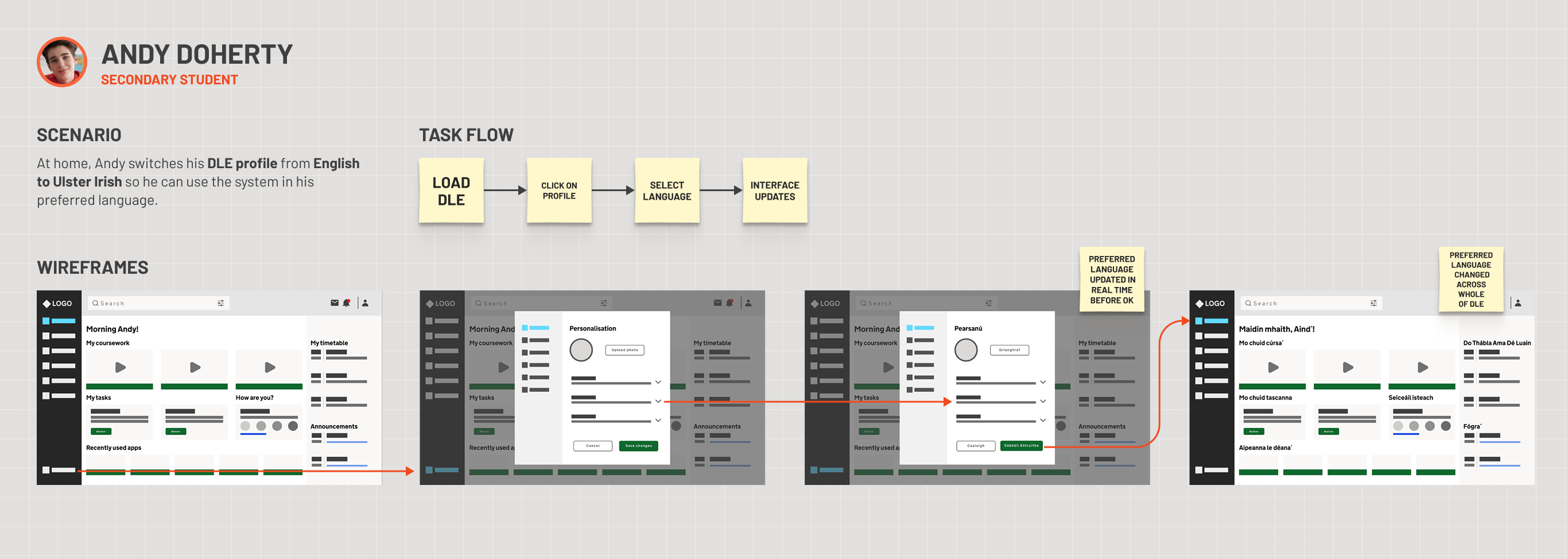
Task flows - Mapped around core scenarios, including logging in, accessing lessons, and adjusting profile settings to personalise the experience
High-fidelity screens – Student desktop
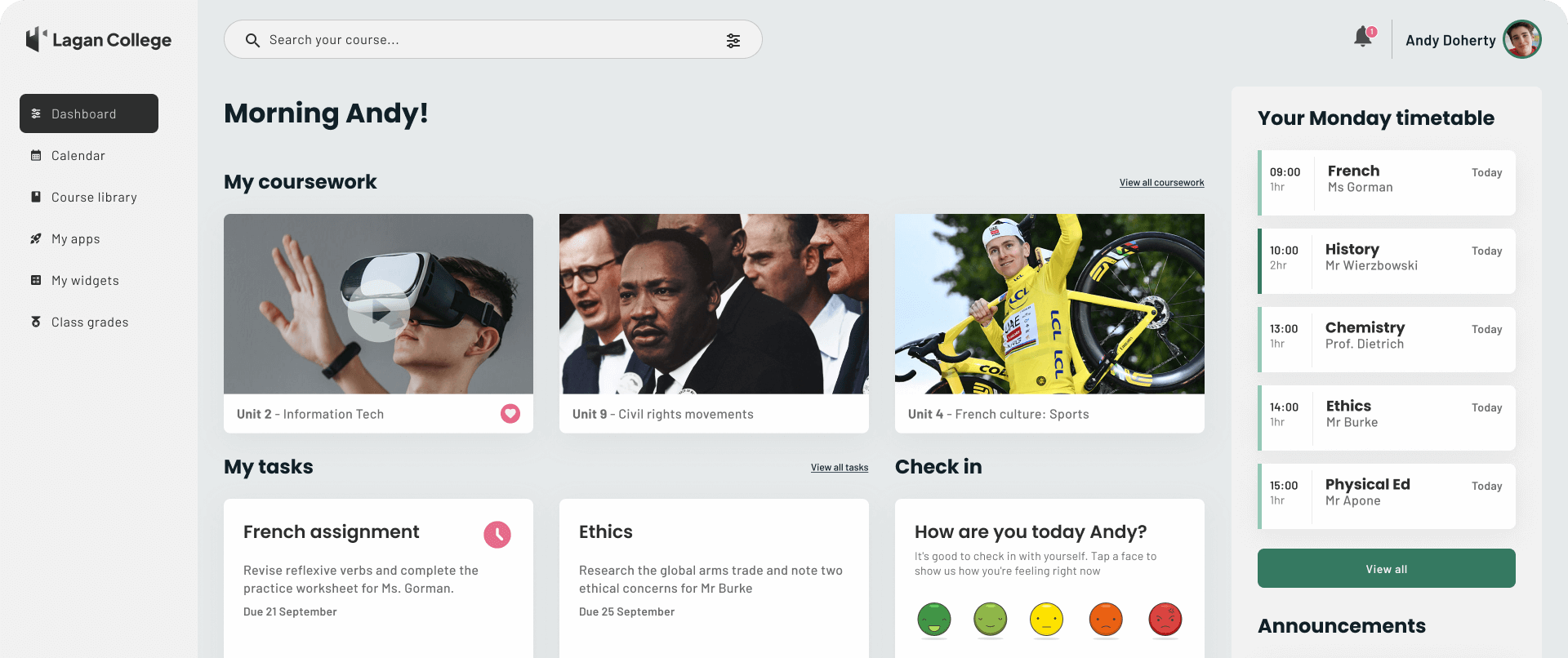
The high-fidelity desktop screens for Andy’s journey show how the DLE can bring together his coursework, tasks, timetable, and announcements into a single, clear view. The design balances a structured layout with youthful touches of colour, giving Andy immediate access to lessons and assignments while keeping space for personalisation. Features such as the check-in widget and recent apps ensure the dashboard feels dynamic and relevant, supporting both academic work and wider school life. Accessibility and clarity were prioritised throughout, so Andy can focus on learning rather than navigating the system.
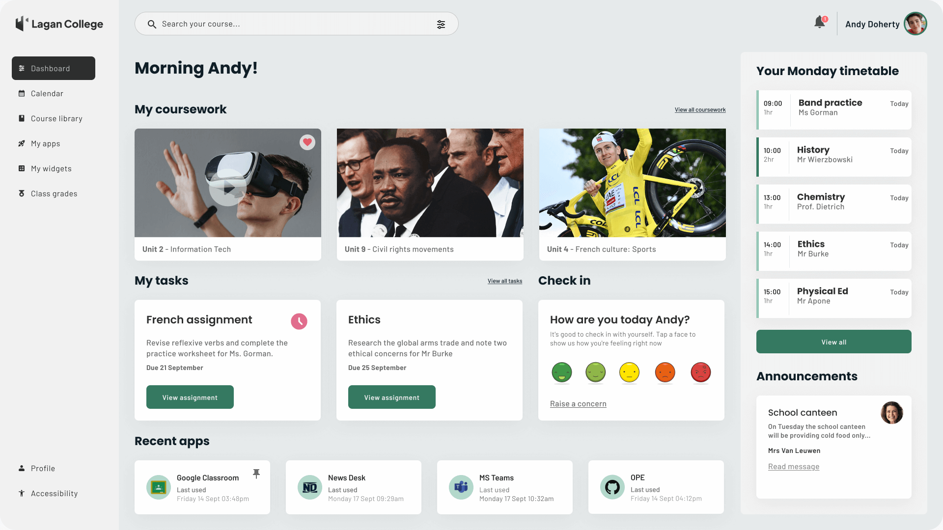
High fidelity screen design - Default DLE student dashboard when Andy logs in each morning
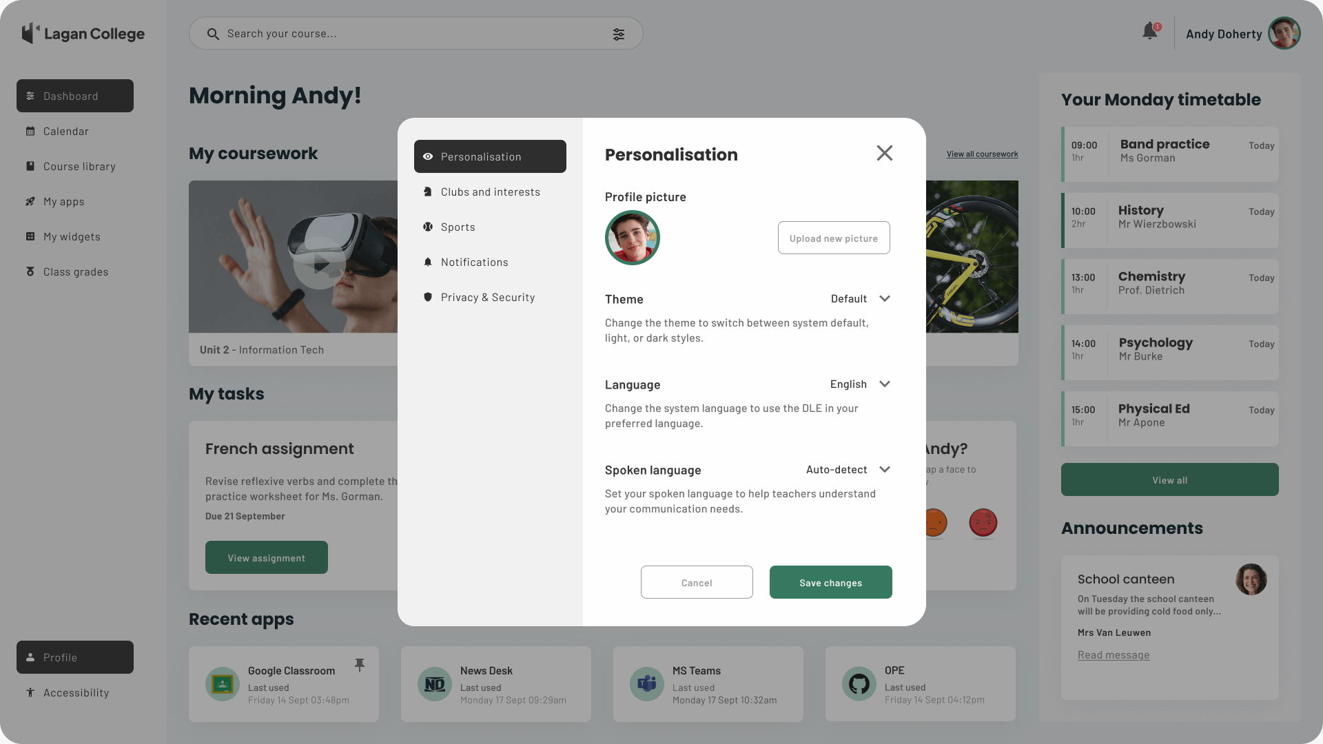
High fidelity screen design - Andy opens the Profile menu to change his preferred language
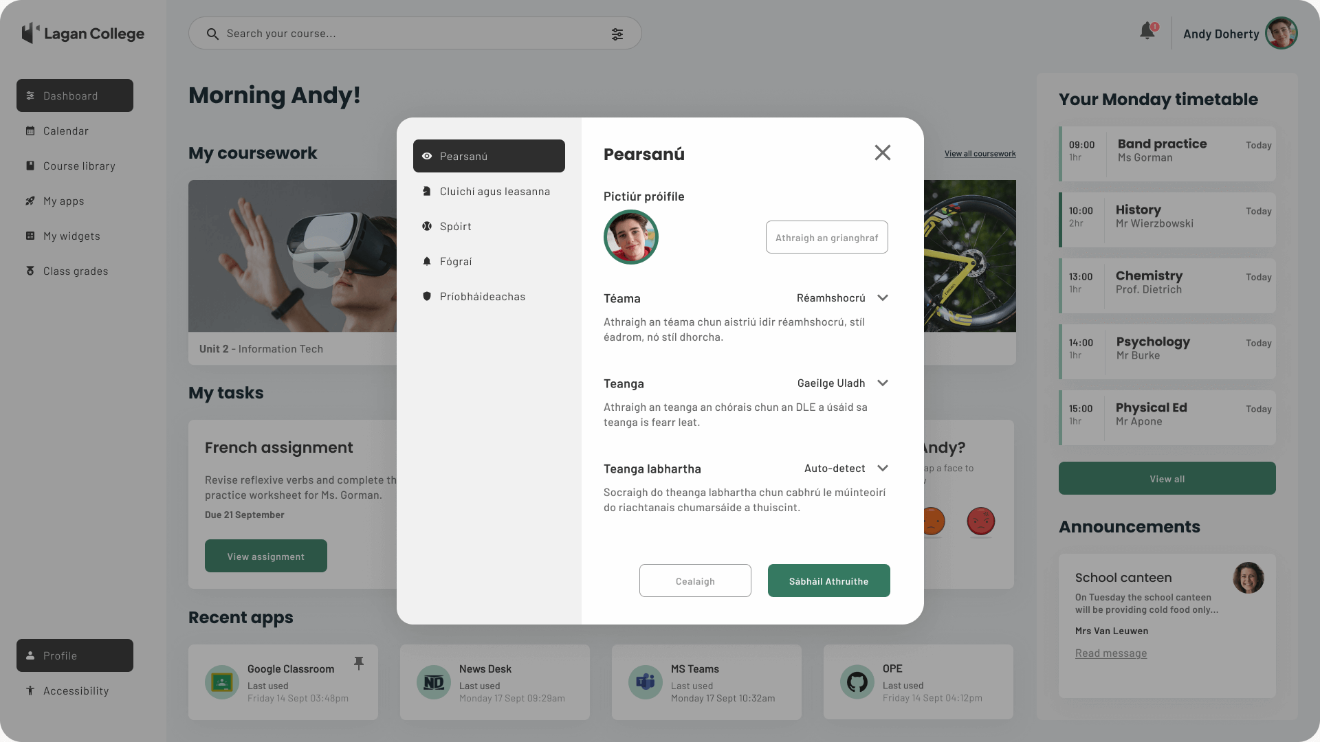
High fidelity screen design - Andy selects Ulster Irish as his preferred language, reflecting his bilingual household
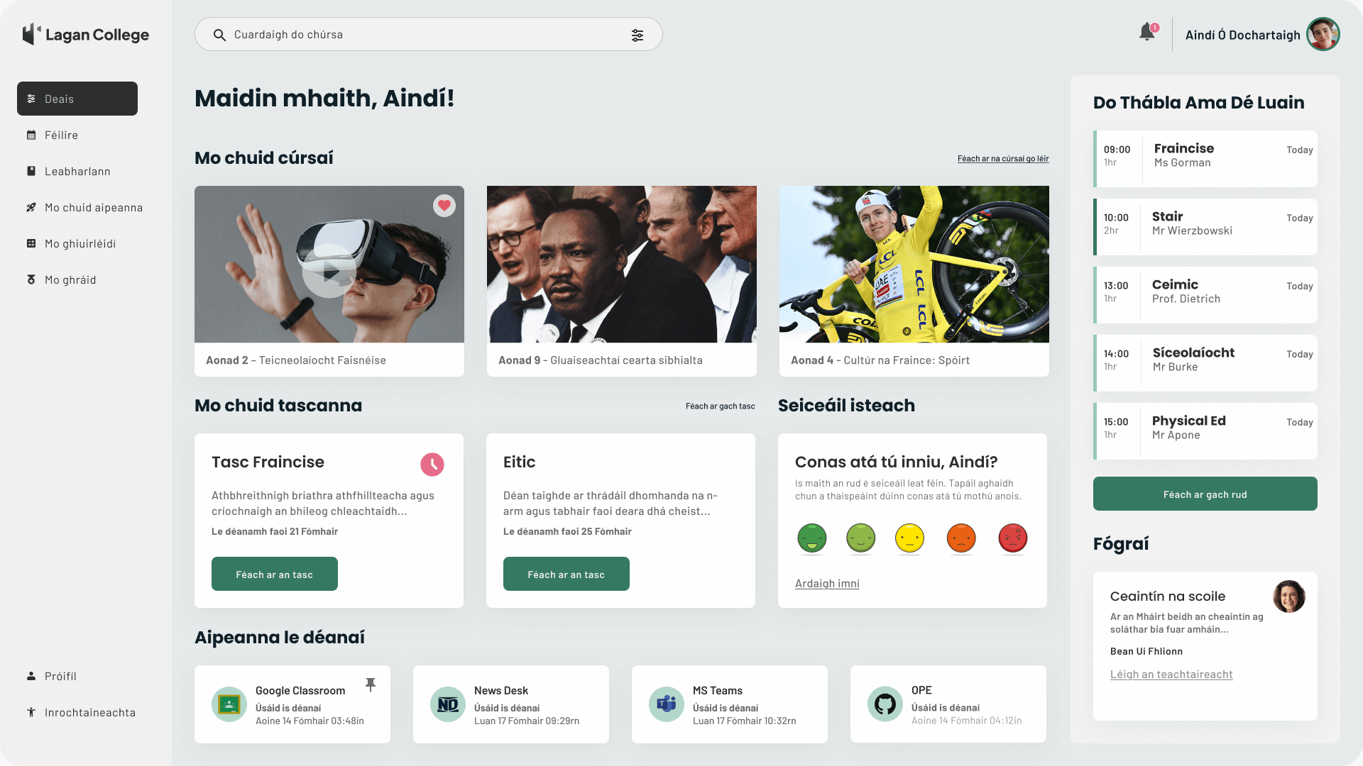
High fidelity screen design - The DLE student dashboard updates to Ulster Irish after Andy confirms his choice
SCENARIO - STUDENT MOBILE NOTIFICATIONS
Andy’s mobile journey explored how the DLE could support him beyond the classroom. When he received a notification about a change to band practice, the update appeared instantly on his mobile dashboard. He was able to confirm the new time directly, with the change reflected in his timetable. This scenario demonstrated how the DLE could seamlessly integrate extracurricular commitments with academic life, ensuring the platform remained relevant and useful throughout Andy’s day.
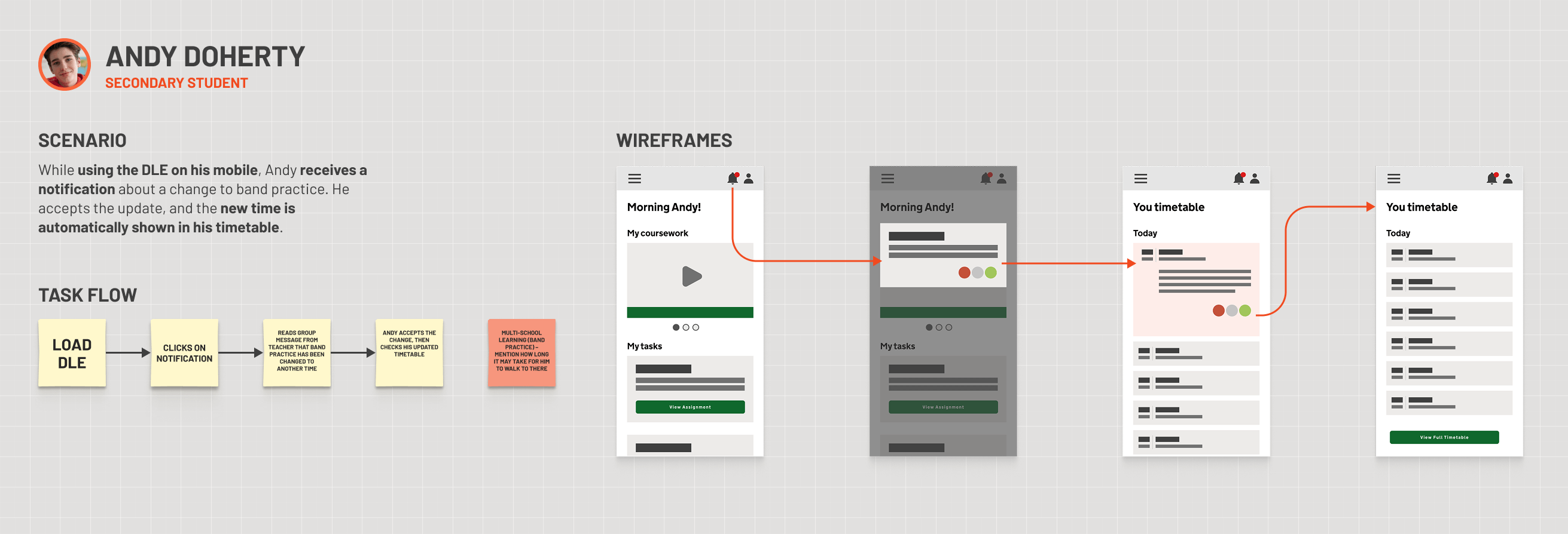
Task flows - Mapped around core scenarios, such as logging in, accessing lessons, and personalising content
High-fidelity screen – Student mobile
The high-fidelity mobile screens emphasised clarity and responsiveness, reworking Andy’s dashboard into a compact format optimised for smaller devices. Coursework and assignments remained visible, but the design also highlighted time-sensitive notifications such as band practice updates. By showing how extracurricular activities could sit naturally alongside academic tasks, the mobile experience demonstrated the DLE’s flexibility and its potential to support the wider student experience.
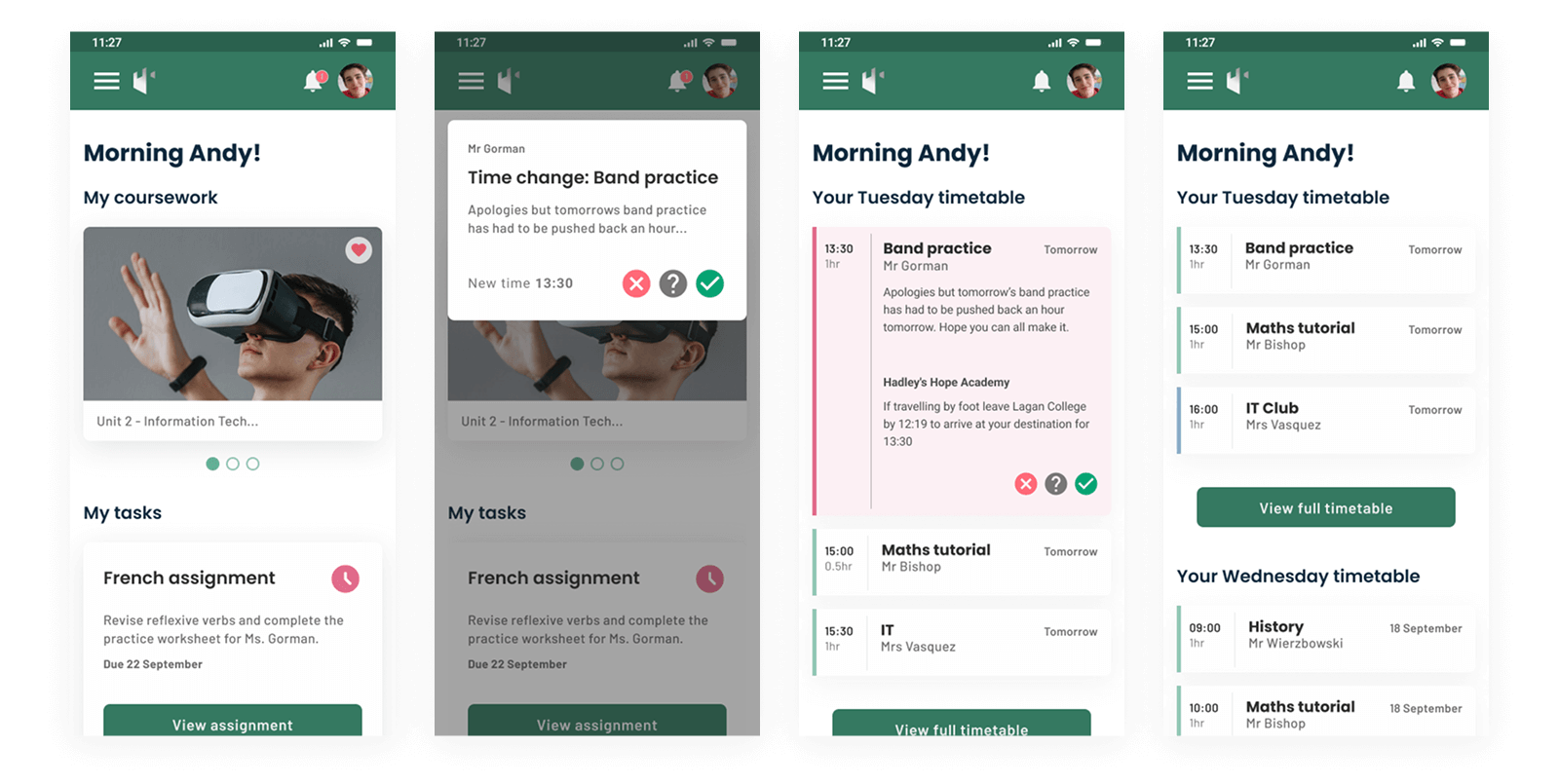
High-fidelity mobile screen designs - Andy receiving a band practice update, confirming the change, and seeing it reflected in his timetable.
Teacher persona

SCENARIO - Teacher Accessibility options
Selina’s scenarios explored how accessibility settings could be adjusted to support her classroom teaching. While presenting lessons on a digital whiteboard, she needed the option to increase font sizes so pupils at the back could follow clearly. The DLE’s accessibility modal gave her direct control over text size and layout, demonstrating how the system could adapt to different teaching contexts without disrupting the flow of a lesson.
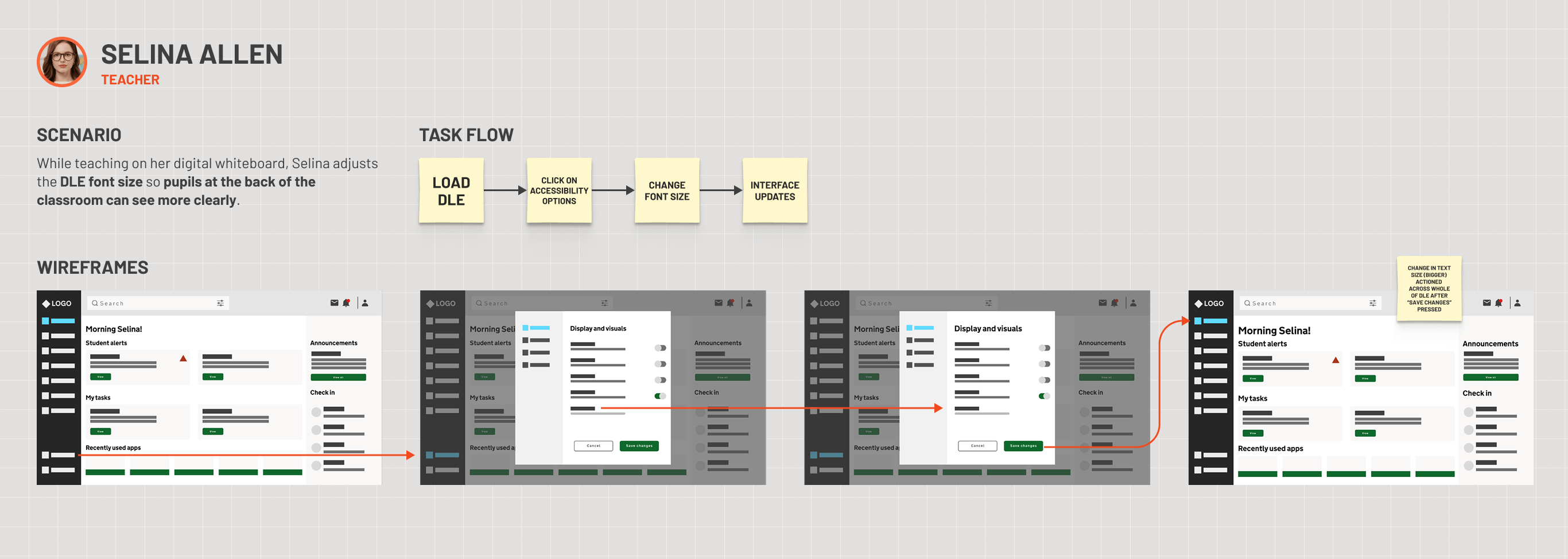
Task flows - Covering logging in, managing tasks, adjusting accessibility, running reports, and monitoring class wellbeing
HIGH-FIDELITY SCREENS – Teacher DESKTOP
The high-fidelity screens for Selina showed how small adjustments could make a big difference in practice. From the default dashboard, she opened the accessibility modal, selected a larger font size, and instantly saw the change reflected across her workspace. This flow highlighted the DLE’s commitment to accessibility, ensuring teachers could adapt the interface to meet the needs of their students in real time.
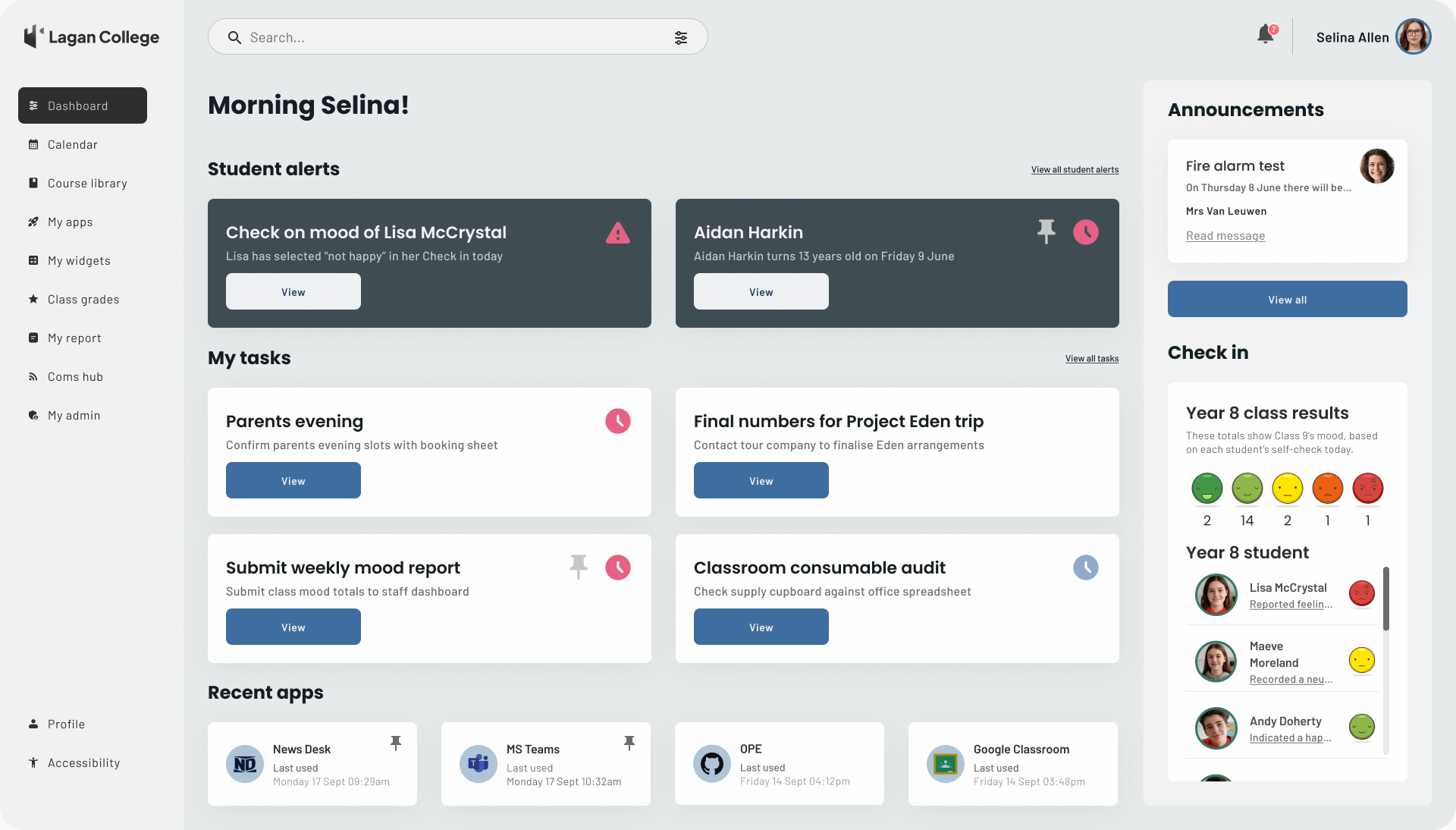
High fidelity screen design - Default DLE dashboard for the teacher persona
High fidelity screen design - Accessibility settings modal within the DLE, available to the teacher persona
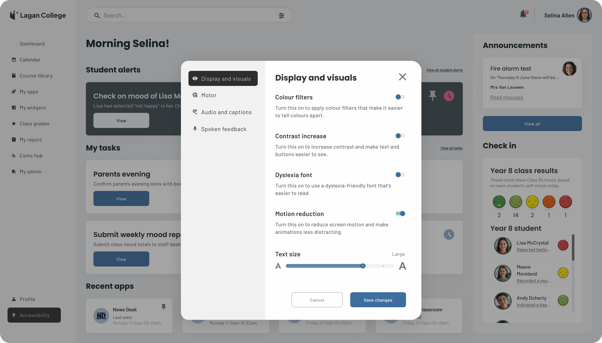
High fidelity screen design - Accessibility modal showing the teacher persona adjusting font size
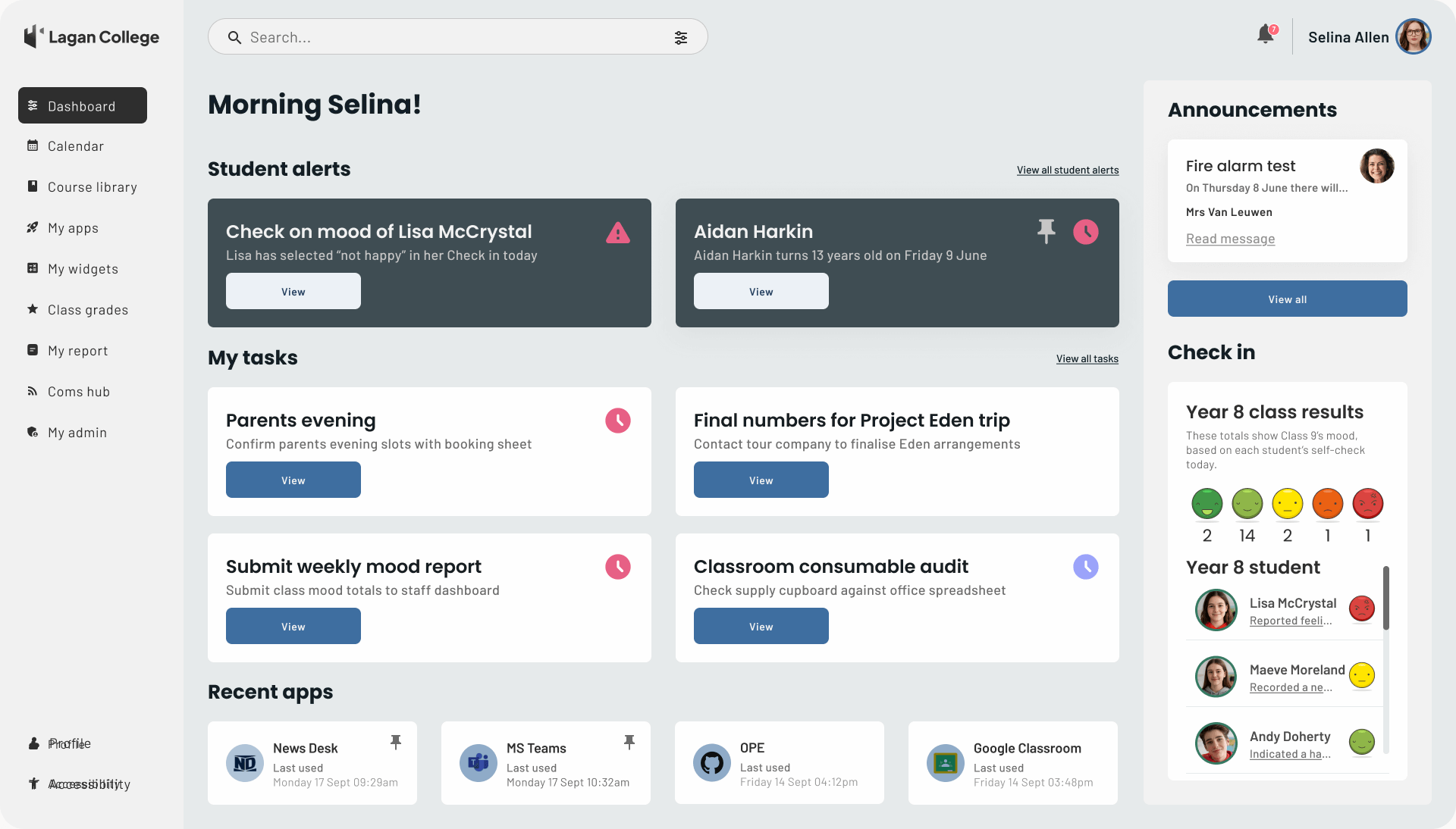
High fidelity screen design - DLE dashboard updated to display the larger text size selected by the teacher persona
Scenario – Teacher running reports
Selina regularly uses the DLE reports dashboard to track more than just academic results. By reviewing attendance, wellbeing indicators, and class points, she can spot patterns that might affect student performance and adjust her teaching approach accordingly. For example, dips in engagement or repeated wellbeing concerns highlight where additional support may be needed. Having this information in a single view helps her make proactive decisions, balancing subject delivery with the pastoral care that underpins student success.
HIGH-FIDELITY SCREENS – teacher reports DESKTOP
Another key feature explored in Selina’s journey was the reports dashboard. The high-fidelity designs illustrated how attendance, college demographics, social-emotional wellbeing, student awards, and class points could be consolidated into a single, accessible view. This gave teachers a clear overview of both individual progress and class-wide performance, supporting data-driven insights while keeping the interface simple and actionable.
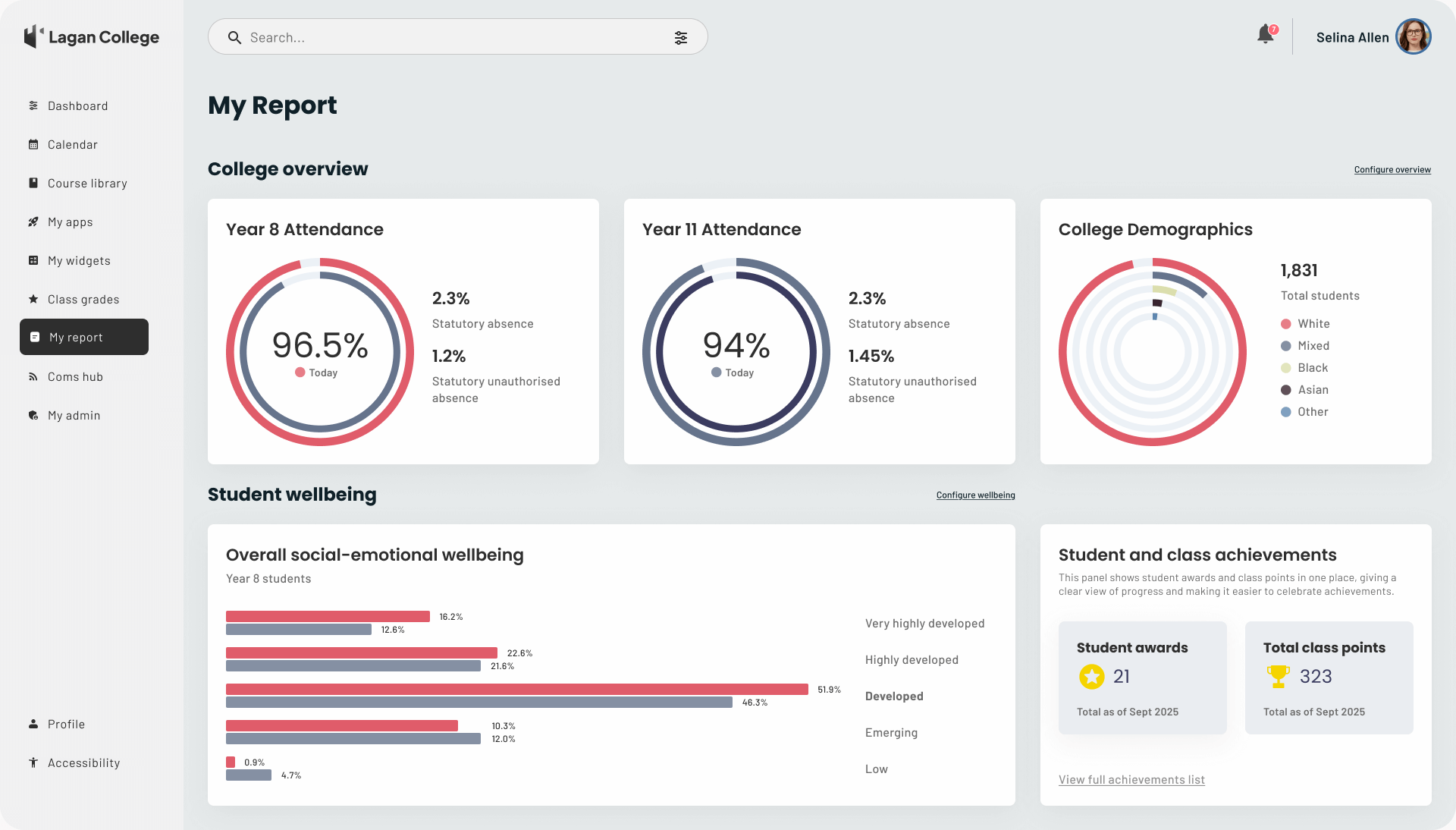
High fidelity screen design - Reports dashboard showing attendance, college demographics, social-emotional wellbeing, student awards, and class points
Overall Challenges
Compressed timelines with shifting requirements
New scenarios introduced at late stages, requiring fast turnarounds
Balancing EA’s desire for polished visuals with the “vision-setting” purpose of the bid
Outcome
The resulting non-interactive prototype gave stakeholders a clear sense of what the DLE could become. It illustrated not just functionality but also the value of a user-centred approach to digital transformation. Feedback was very positive: the bid team credited the UX work with helping Capita progress to the next round of the procurement process.
Key insights
Agility matters in bids: UX needs to flex rapidly to absorb new requirements and deliver high-fidelity outputs under tight timeframes.
User-centred vision sells: Even at the pre-sales stage, showing a clear, human-focused design direction helps differentiate a bid.
Design choices must be holistic: Accessibility, colour psychology, and age-appropriate typography are not “extras” but core to making a platform work for diverse users.
UX has strategic impact: Beyond screens and flows, good UX design can strengthen positioning in competitive, high-stakes environments.
Next steps
The work I produced in Round 8 was successful, and the team was scheduled to proceed to Round 10 of the bid process, with a continued requirement for UX involvement and deliverables. This validated the value of a user-centred design approach throughout the bidding process.
